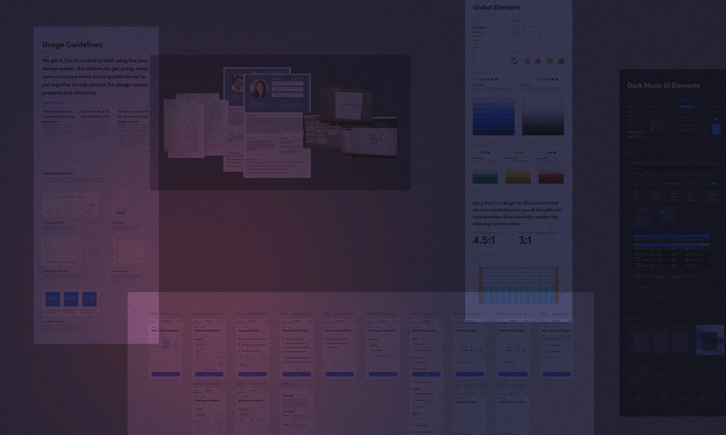
The Power of Scalable Design.

A comprehensive design system built in Figma that brings order to chaos across a large team of designers and developers to unify an ecosystem of digital products for DCP Midstream's digital transformation.


My Role:
Strategy & Research
Branding
Product Design
Design Ops
Design System

Stage:
Enterprise

Sector:
Energy
Natural Gas
Logistics & Supply Chain for Energy

 
DCP_DesignSystem_BKGD2.jpg


The Problem:

How do we create consistency and efficiency across multiple digital products when the department was in disarray, with different design styles, toolsets, and scattered files?


The Solution:

Implement Design Ops, standardize toolsets, and create a cohesive design system that would enable consistent user experiences and efficient design processes across all products in DCP's digital transformation.


Key Components:

  • Design Operations Implementation – Restructured the design department by hiring talented team members and establishing standardized processes and workflows.

  • Centralized Component Library – Created reusable colors, character styles, and components in Figma that could be shared easily among the team and centrally managed.

  • Motion Design Guidelines – Developed specifications for animations and transitions that could communicate intended behaviors to developers without building them into every prototype.

  • Standardized Patterns & Interactions – Established consistent interaction models and UI patterns to create familiarity for users across the product ecosystem.

  • Cross-Product Implementation Strategy – Deployed the design system across twelve different applications while maintaining flexibility for product-specific needs.


Header_BG.png


Usage Guidelines for both Desktop and Mobile

Design Guidelines for both Desktop and Mobile


Desktop Guidelines—Global Elements

Mobile Guidelines—Global Elements


Desktop Guidelines—Light Mode UI Elements

Mobile Guidelines—Light Mode UI Elements


Desktop Guidelines—Dark Mode UI Elements

Mobile Guidelines—Dark Mode UI Elements


Motion Design Guidelines


Header_BG.png
 

Product Load Demo

Date Picker Demo

Card Swipe Demo

Segmented Controls Demo

Card Expansion Demo

Top Sheet Demo

Voice-To-Text Demo

Dark Mode Toggle Demo


The Results:

  • Enhanced Design Efficiency – Significantly reduced time spent in wireframing and prototyping phases through reusable components and established patterns.

  • Unified Product Ecosystem – Created a cohesive visual and interaction language across all digital products at DCP Midstream.

  • Improved Team Collaboration – Enabled designers and developers to work from a single source of truth, reducing miscommunication and rework.

  • Scalable Design Framework – Established a foundation that could evolve and expand as new products were developed within the digital transformation initiative.

  • Streamlined Onboarding – Simplified the process of integrating new team members into projects with clear design guidelines and ready-to-use components.


FATE_BG_RGB_darkgrey.png


Explore Other DCP Midstream Projects:

 
FATE_BG_BlueGrey_RGB.png